Gadget-Oriented Dashboards
ExpertFlow Dashboards & Wallboards application allows the contact center administrators, supervisors and agents to customize new dashboards as per the needs of the business. Each user can create its own dashboard or admins create a contact center Wallboard to be displayed on a large screen in a room.
The application comes with predefined gadgets (display types and data stats) to be added on a dashboard container. The user can then customize the gadget to see the attributes important to the business while hiding the rest of the other attributes.
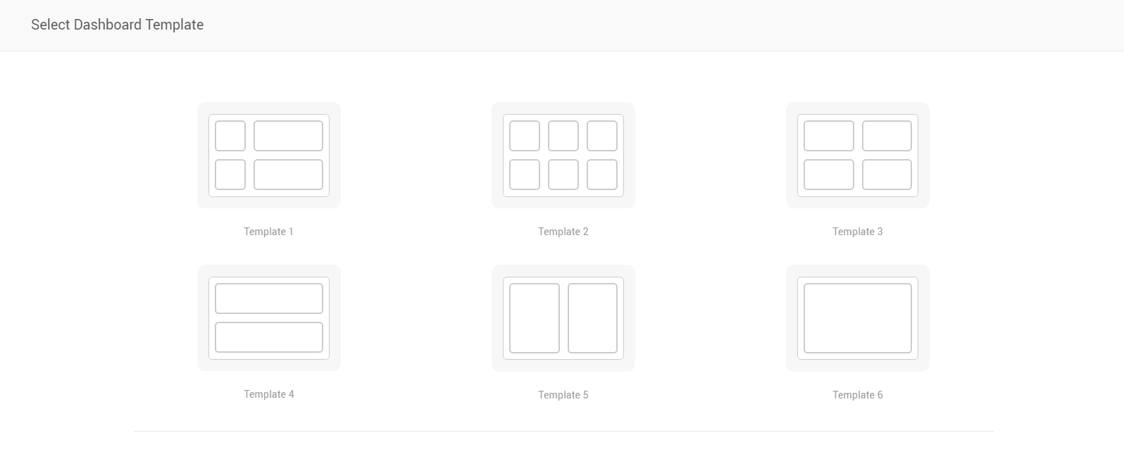
Predefined Layouts/ Dashboard Templates
The application also provides some predefined templates to be used while designing the dashboards. Each time the user has to create a dashboard, it chooses a template from the list of predefined templates to define the dashboard layout. Gadgets are then added to the dashboard following the selected template.
Display Types
The display type defines how the data will be displayed in a gadget. A user-defined gadget carries a specific display type and data logic as defined by the user while adding the gadget into a dashboard.
Following are the visuals and display types as available today:
-
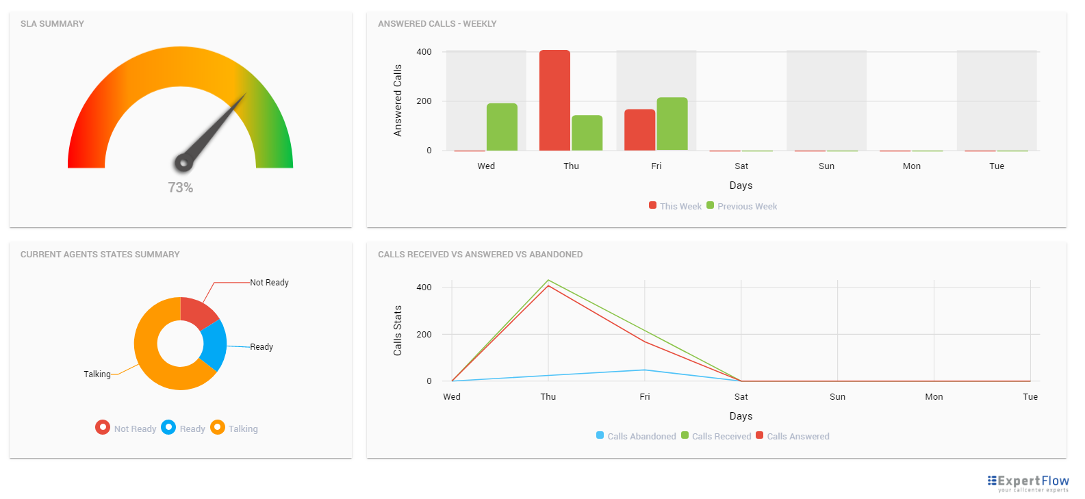
Pie Chart: Draws the data in the form of a pie chart. Used to display real-time data across particular answer categories. For a call center dashboard, this display type can be particularly useful for showing current states of agents in a team using Agent Data Service.
-
Doughnut Chart: Draws the data in the form of a doughnut. Used to display real-time data across particular answer categories. While showing call center stats, this display type is particularly useful for showing current states of agents in teams using Agent Data Service.
-
Scorecards: Each data attribute is represented by a square box called a "scorecard". While viewing call center stats, this display type is particularly useful for viewing real-time queue stats and reporting interval stats (for CCE only), using Queue data service.
-
Line Chart: Draws a line chart of the selected data statistics based on the specified resolution (daily, hourly). While viewing call center stats, this display type is only relevant while showing historical data of calls based on the Queue data service for calls answered, abandoned, and received.
-
Bar Chart: Draws a bar chart of the selected data statistics based on the specified resolution. While viewing call center stats, this display type is only relevant while showing historical data of calls based on the Queue data service for calls answered, abandoned, and received.
-
Text Message: To display a static text message on the dashboard.
-
Greeting Message: To display a static text message with a greeting such as "Good Morning Team!" on the Wallboard
-
Data Table: To display data in a tabular format. While viewing call center statistics, you may see the agent teams summary across all teams in a table, using Agent Data Service.
See the screenshot below.
Data Services
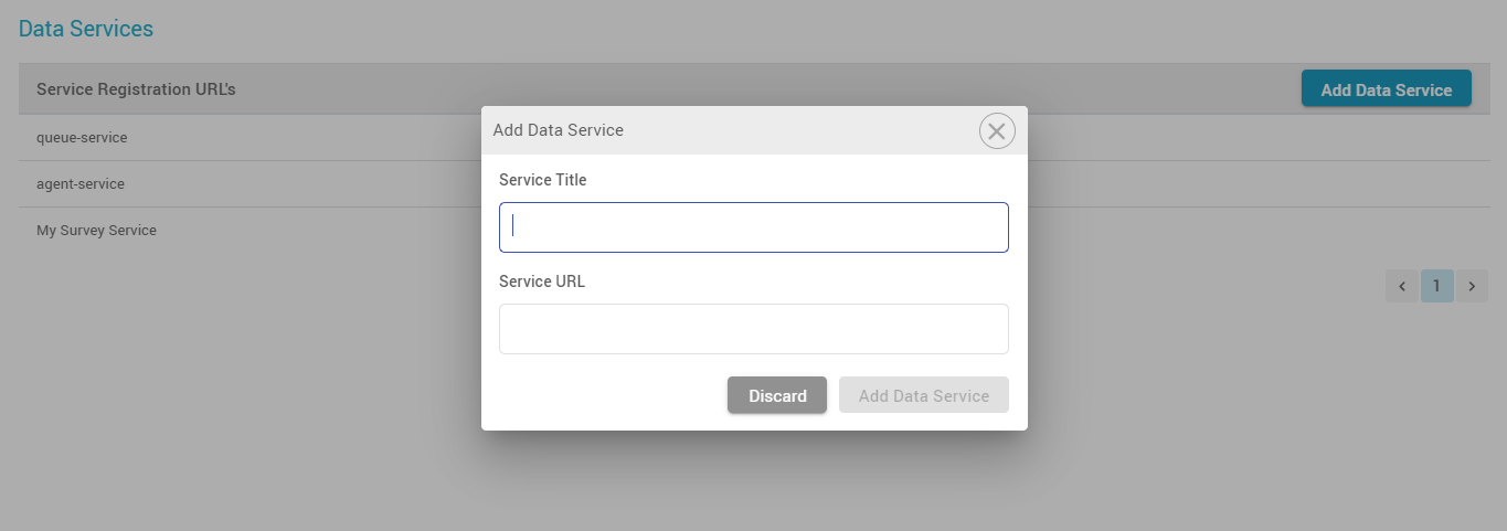
Dashboards or Wallboards refer to a data service (or data source) to report on the statistical data in a gadget. A Data Service is a REST+GraphQL-based microservice that returns real-time and historical data attributes to be displayed on Dashboards and Wallboards.
The application comes with two prebuilt data services that report on queues and agent statistics.
-
Queue Service: This reports all the statistics related to the contact center queues/ skill groups such as calls received, answered, abandoned, SLA based on queues or skill groups.
-
Agent Service: This reports all the statistics related to the team agents such as Current state, Time in the state, ASA, AHT of agents.
-
The Queue Data Service only caters inbound call queues to show the inbound call statistics. Outbound campaign call stats cannot be shown on the Wallboard.
-
Any 3rd-party application can also write its own data services to return any real-time and historical data to be displayed on dashboards and wallboards. For instance, a data service connected to the reporting DB of a CRM to report on statistics from the CRM.
Consolidate Call Center Stats
See the consolidated statistics of the call center by selecting all (or not selecting any) skill groups while drawing a gadget on the dashboard. Choose the data aggregation type as one of the following:
-
Sum: Choosing this option sums up data of all selected attributes across all skill groups or teams.
-
Average: Choosing this option takes an average of all selected attributes across all skill groups or teams. This is also the default aggregation type for the Speedometer display type.
-
Count: This counts the occurrences for a particular value in the database and shows the total count. This is the default aggregation type for Pie and Doughnut charts and is currently only applicable to Pie and Doughnut display types.
-
While viewing consolidated statistics of the contact center, use the Queue Data Service to view calls summary (such as calls answered/received/abandoned, SLA) and Agent Data Service to view agents statistics (such as logged in, ready, not ready)
-
Choose the Scorecard view to show the call stats summary and Pie/Doughnut to show the agent stats summary.
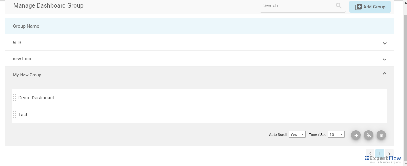
Dashboard Groups
A dashboard group is a group of multiple dashboards that allows the user to set scrolling intervals to display each dashboard in the group one by one.
Generate a URL of the group to see all dashboards in the group in the browser window.
No user authentication is required for now to access the final link of a dashboard group.
Auto scrolling and ordering among dashboards in a group
The auto-scrolling feature allows scrolling dashboards in a group in the sequence and interval as defined by the user in the Dashboard Group definition.
Link sharing of dashboards and dashboard groups
Get the URLs to the dashboards and dashboard groups to see your final dashboard(s) as Wallboards on a big screen in a browser tab.
By default, anyone with the link can access the dashboards. No user authentication is required for now to access the final dashboards.
Light and Dark Color Backgrounds
Choose a dark color theme to display your wallboard with a darker background or a light theme to display it on a lighter background.
APIs for 3rd-parties to report external system statistics
ExpertFlow exposes Data Services model (REST/ GraphQL APIs) to urge external systems to report on their data in the ExpertFlow Dashboard application. The 3rd-party data service should then get itself registered with the ExpertFlow application. The application then calls APIs of the external service to display the statistics from the 3rd-party system.
Note:
-
Multi-tenancy on Dashboards is not supported as of today; i.e. a user, for instance, who has the access to the application can view all dashboards irrespective of the tenant or team to which he belongs.