Introduction
ExpertFlow Dashboards & Wallboards application allows the contact center administrators, supervisors and agents to customize new dashboards as per the needs of the business. Each user can create its own dashboard or admins create a contact center Wallboard to be displayed on a large screen in a room.
The application comes with predefined gadgets (display types ) to be added on a dashboard container. The user can then customize the gadget to see the attributes important to the business while hiding the rest of the other attributes.
There are six different templates. So user can create dashboard in six different ways. User can also add gadgets to the dashboard. The gadgets are
|
|
Different dashboards can be added in a Dashboard Group. The link can be generated for the dashboard and dashboard group. The dashboard can also be copied. User can also add Data Services URL in it. Settings are used to update the logo
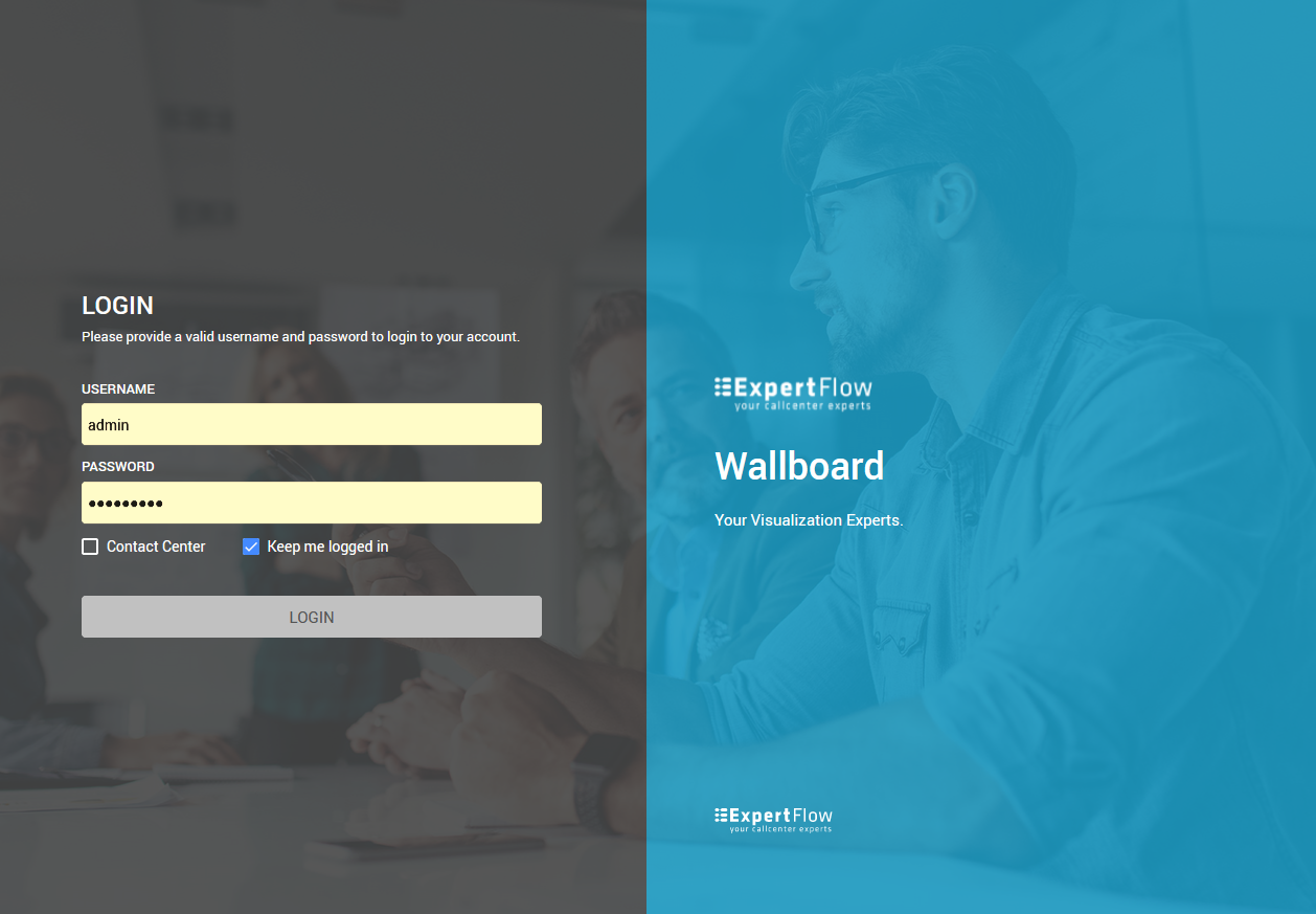
Logging in
ExpertFlow applications have a central User Management and Authentication module that automatically synchronizes contact center agents, supervisors from Cisco and allows any contact center agent to log into the application with the same Finesse credentials, without the need to create a new username/password in the application. However, administrators can also create local user accounts to give access to particular users.
Therefore, while logging in, you should select the Contact Center checkbox if you are logging in with your Cisco Finesse credentials. Leave this blank if you are logging in as an admin or with local database credentials.
Logging in to the Dashboards&Wallboards
The application also supports single sign-on with Finesse. Therefore, if you're already logged in on Finesse, click on the button Login With Cisco to login to the application using Cisco Finesse credentials.
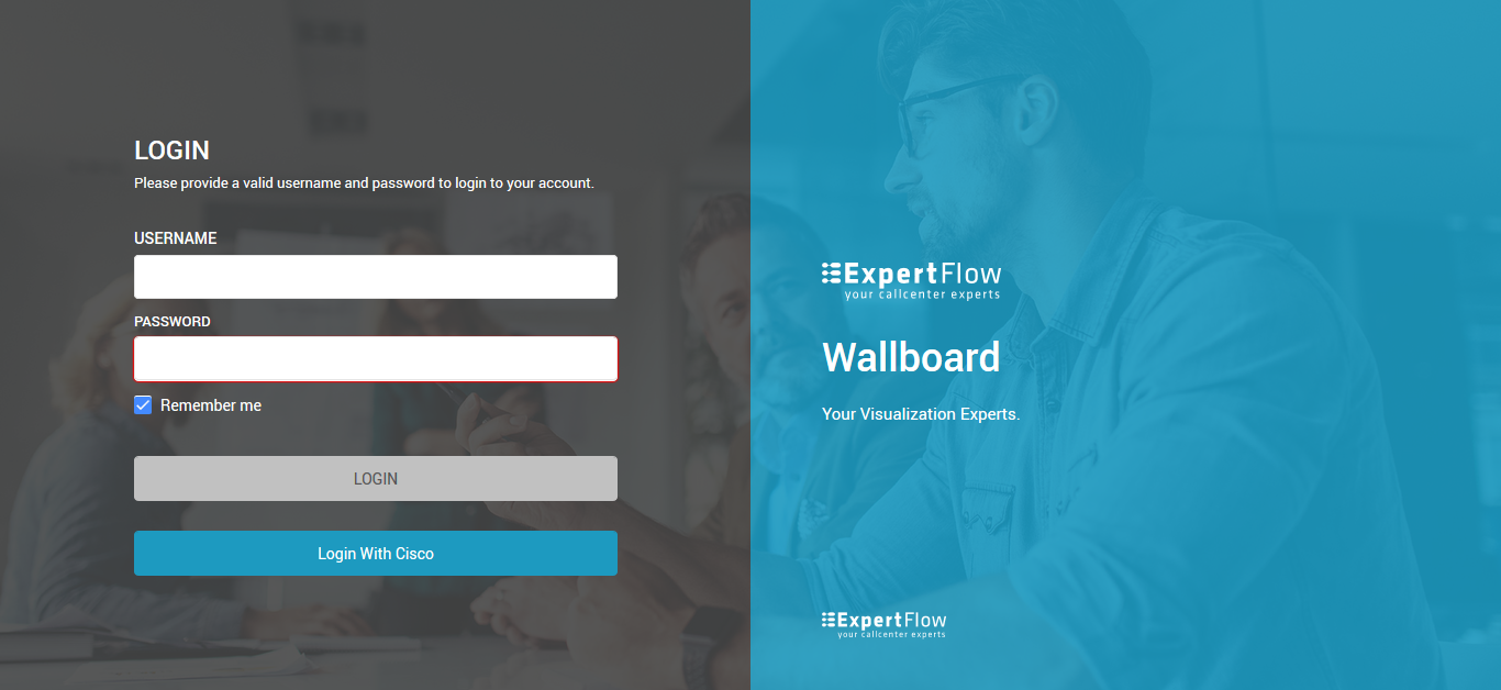
Logging in to the Dashboards&Wallboards with SSO
Create a Dashboard
On the Manage Dashboards page, click Add Dashboard.
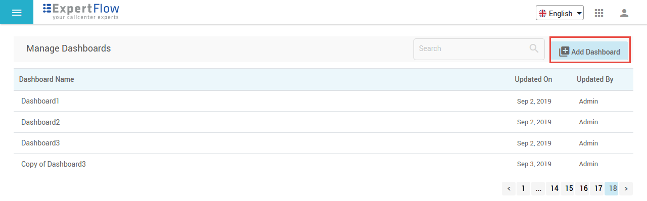
Dashboards List
The application shows some predefined dashboard templates to choose from. A Dashboard Template is a predefined structure of a Dashboard display. The dashboard designer can choose a template from a list of six templates to create a new dashboard.
Choose one template from a list of six templates and start adding gadgets to it.
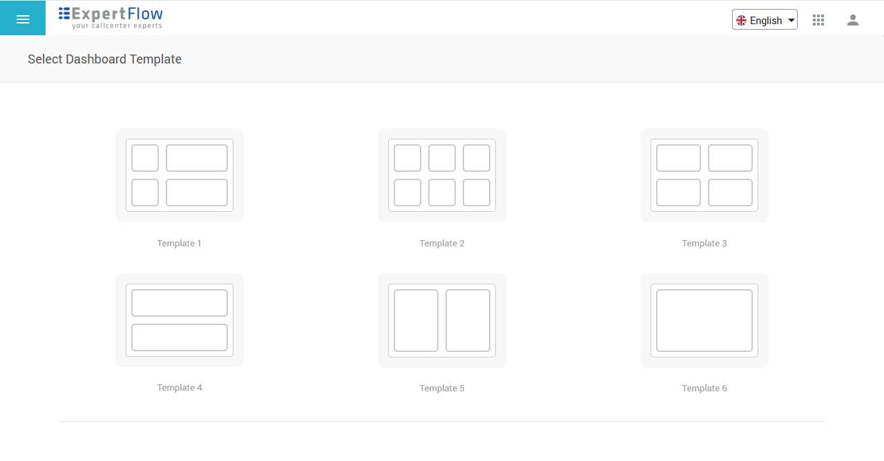
Dashboard Templates
Once a template is selected, the application automatically creates a dashboard with the selected template with a default name.
Once a dashboard is created, you may start adding desired gadgets into it.
A Dashboard without gadgets
While changing the name, Theme Color or, dashboard Timezone, click the Update button to save the changes. All the changes would be lost, otherwise.
Once a dashboard is created, the template of the dashboard cannot be changed later. If you need to change the dashboard template, you'll need to create a new dashboard with the desired dashboard template.
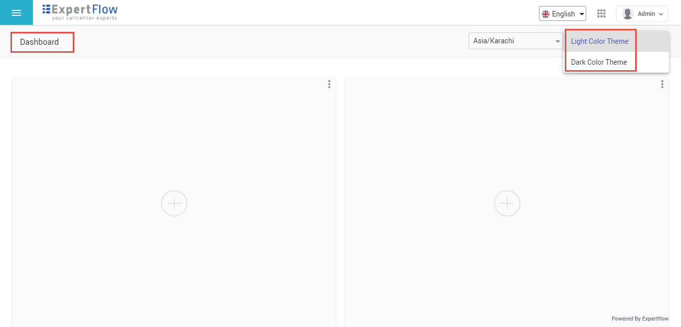
Change Theme Color
You may also change the Theme color of your dashboard. The application currently supports only two color themes.
-
Light Color Theme: The dashboard background is shown in white color. This is the default theme color of each new dashboard.
-
Dark Color Theme: The dashboard background is shown in black color.
Change Timezone
You can also change the timezone of each dashboard that you create. This ensures that each new dashboard can have its own timezone to display the stats of this dashboard in a different timezone.
Add gadgets in a dashboard
A Gadget is a graphical representation of statistical data being displayed to a Dashboard. It is comprised of two parts:
-
Display types: A visualization type for displaying the data. The available display types are
-
Pie chart
-
Doughnut chart
-
Speedometer
-
Line chart
-
Bar chart
-
Table
-
Scorecards
-
Greeting Message with a heading text
-
Simple Text Box
-
-
Data source: A data source is the Data Service (registered with the Wallboard application) from where to pull the data on the dashboard. Data service is a REST+GraphQL-based microservice that exposes some real-time and historical attributes to be displayed on Dashboards and Wallboards. Any third-party application can write its own data services to report stats from the external system. The following data services come out-of-the-box with the application:
-
Queue Service: Reports statistical data related to a Contact Service Queue (in case of CCX) or Skill Groups (in case of CCE). See Integration Specifications with CCX and Integration Specifications with CCE
-
Agent Service: Reports statistical data related to team agents.
-
Once a dashboard is created, click the + icon in each square box to add a gadget to it.
Choose a display type to determine the layout of the gadget content.
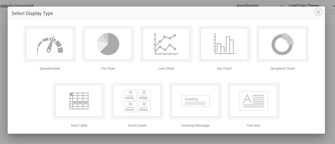
Select Gadget Display Type
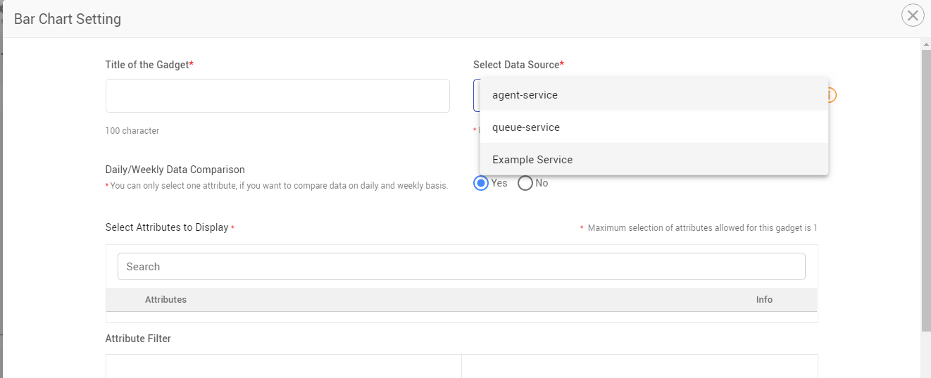
The Gadget Settings window is popped up based on the display type that you select. Define the configurations of the gadget on the following screen using the table below:
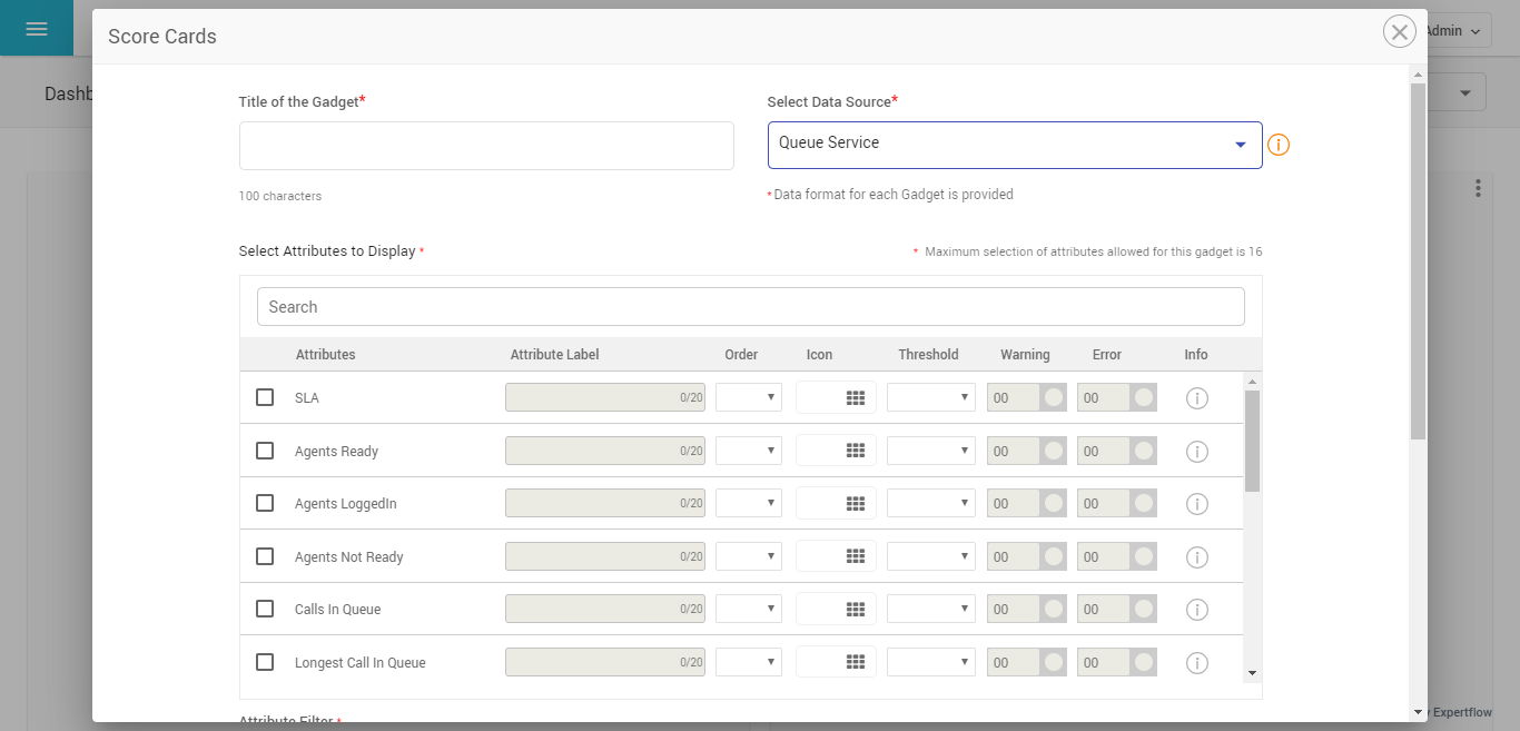
Gadget Settings for Scorecards
|
Field Name |
Description |
Required |
|---|---|---|
|
Title of the Gadget |
Give the name of the gadget here |
Yes |
|
Selection of Data Source |
Choose the data service/data source to pull the data. The application comes with two built-in data services for displaying call center stats;
|
Yes |
|
Select Attributes to Display |
Choose the attributes to be displayed in the gadget. This lists all attributes exposed by the selected data service. The info icon against each attribute provides a brief help text for the attribute description. By default, the application restricts the number of attributes to be displayed in each display type:
|
Yes |
|
Attribute Labels |
These are the user-defined labels of attributes exposed by the data service. Give a different label or name to data attributes according to your convenience. If not defined, the default labels will appear. This option only appears for the following display types:
|
No |
|
Attribute Thresholds |
Define here the threshold values for certain attributes. You can define thresholds on two levels: i) Warning: For a warning or an alert situation ii) Error: To indicate a critically-alarming situation. Also, choose a color for each threshold value which determines the color code of the attribute value when the threshold is met. While defining the threshold, select the operator Above or Below as threshold criteria. When you select Above, the application assumes the threshold to be breached only if the current value of the attribute is greater than the defined threshold values. Similarly, if you select Below, the threshold is assumed to be breached if the current value of the attribute goes lower than the threshold values. This option only appears for the following display types:
This remains disabled by default. |
No |
|
Icons |
Choose an icon from a predefined list of icons, to show the attribute card with an iconic presentation. This is valid only for the scorecard display type. |
No |
|
Attribute Order |
Define the order in which the attributes must be listed on the final gadget display. While selecting the attributes and giving the order, make sure to provide valid order values based on the number of selected attributes If not defined explicitly, the application automatically assigns an order to each attribute based on the order of selection. This is valid only for the following display types:
|
No |
|
Attributes Filter |
This is the filter to populate the appropriate, desired data in the gadget. Each data service exposes a filter based on which the data should be displayed. For the built-in data services, the attribute filters exposed are Queue and Team, for Queue and Agent microservices respectively. This means that the data is shown based on a CSQ or an agent team for the UCCX and this is shown based on a Skillgroup or an agent team for the UCCE, Based on the attribute filter, you can then filter out the statistics against one or multiple queues or one or multiple teams. In case of no selection of queues or teams, the application automatically accumulates statistical data across all queues or teams. |
Yes |
|
Daily/Weekly Data Comparison |
This is valid only in the case of Line and Bar chart display types and for historical data attributes. If set to Yes, this allows you to see the data comparison for a single attribute in the past hours or past weeks based on the selected Resolution type. In the case of Bar charts, the bars that appear represent the past hours (of today and yesterday) or weeks (this week and previous week). If set to No, you can select multiple attributes from the available list to see lines or bars for each different attribute. By default, this flag is set to Yes. |
No |
|
Resolution |
This is valid only in the case of Line and Bar chart display types and for historical data attributes. Following data resolution types are supported:
By default, this is selected to Weekly resolution. |
No |
|
Ranges |
This selection appears only for the Speedometer gadget.
You may choose the speedometer needle range here. Choosing -100 to +100 shows the extreme two positions of the needle at -100 and +100, whereas choosing 0 to 100 is more relative for displaying SLA (or any attribute whose value may fall between 0 to 100). |
|
|
X-Axis Salutation |
This is valid only in the case of Line and Bar chart display types and for historical data attributes. Provide the labels to be displayed on the X-axis of the graph. |
Yes |
|
Y-Axis Salutation |
This is valid only in the case of Line and Bar chart display types and for historical data attributes. Provide the labels to be displayed on the Y-axis of the graph. |
|
|
Aggregation Type |
The following types of data aggregation are supported:
In the case of showing accumulated data of multiple (or all) queues or teams, this determines that the data aggregation should be done based on Sum, Average, or Count. This is not valid for the Data Table display type, since this type does not show group or aggregate values of attributes but shows individual rows for each queue or team. |
No |
|
Greeting Message Title |
This is the title of the greeting message to be shown on the Greeting Message gadget. This can take any string of 100 characters such as "Good Day". You can optionally also choose the font color of the greeting title. This is valid only for the Greeting Message Gadget. |
Yes |
|
Greeting Message Text |
This is valid only for the Greeting Message Gadget. Write a greeting message here that you want to display on the dashboard or wallboard. You can optionally also choose the font color and font size between 14px to 36px of the greeting message. |
Yes |
|
Text Box Message Text |
This is valid only for the Text Message Gadget. Write a plain text message here that you want to display on the dashboard or wallboard such as a notification or team announcement. You can optionally also choose the font color and font size between 14px to 36px of the text message, you can also choose the background color of the gadget. |
Yes |
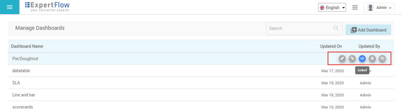
Once a dashboard is created, you can search your desired dashboard by giving the name of the dashboard in the Search bar. The following actions are available for each dashboard on the Dashboard list.
-
Edit: Hover your mouse on the desired dashboard and click the Pencil icon to edit the dashboard
-
Copy Link: Get the final link of the dashboard by clicking the link icon. The link will automatically be copied to your clipboard. Copy and paste it in a browser window to open the dashboard as the final view
-
Embed: You can also embed the dashboard by clicking on the embed button you can get the iframe.
-
Make a copy: You can add a dashboard quickly by making a copy of the dashboard. Once the copy is created, you can edit the name, theme color and edit/add gadgets in the new dashboard. However, the template of the dashboard cannot be modified once a dashboard copy is generated.
-
Delete: Delete unnecessary dashboards from the list. Deleting a dashboard deletes all the gadgets added to the dashboard.
-
New gadgets are saved automatically once the gadgets are configured successfully through the Gadget Settings, without the need to press the Update button.
-
The Queue Data Service only caters to inbound call queues to show the inbound call statistics. Outbound campaign call stats cannot be shown on the Wallboard.
-
Any 3rd-party application can also write its own data services to return any real-time and historical data to be displayed on dashboards and wallboards. For instance, a data service connected to the reporting DB of a CRM to report on statistics from the CRM.
Understanding Line / Bar Charts
Line and Bar charts display the historical data only with the difference that each attribute is either represented by a line or a bar. Any data attribute with the historical flag turned ON can be selected to be viewed in these charts. For the built-in data services, only the Queue data service exposes historical data attributes which are as following:
-
Calls Received
-
Calls Answered
-
Calls Abandoned
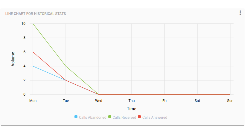
Line Chart - Weekly with Data Comparison set to False
In the above screenshot, the line chart displays days of the week based on the current day and in ascending order. For instance, in the above screenshot, assume the current day as Monday. The chart is set to display all historical call attributes in the Weekly resolution (so turning OFF the Data Comparison flag). The x-axis shows the days of the week in the oldest to the latest order, i.e.
Monday → Tuesday → Wed → Thu → Fri → Sat → Sun (so oldest to latest)
Note that the statistics for the current Monday are only available on the following day, i.e. Tuesday. Y-axis plots the call volume.
If the resolution is set to Hourly, the x-axis shows the hours of the day in ascending order (oldest to latest) for the past 24 hours. However, the current hour is also displayed on the graph on the x-axis and the data updates in realtime for the current hour. For instance, if this is 1:15 PM when the graph is plotted, the data based on the hourly resolution is displayed as depicted in the screenshot:
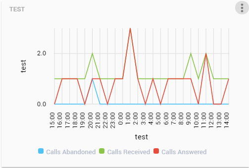
Line Chart - Hourly with Data Comparison set to False
As shown in the screenshot, the x-axis plots the data starting from 3 pm yesterday till 2 PM today while updating the data in real-time for the hour of 1-2 PM.
In the case of having the Data Comparison set to true, the chart shows the data for a single attribute and compares its value either against the previous day of the week and this day of the week OR same hour previous day and same hour this day.
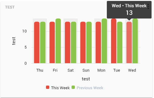
Bar Chart - Weekly with Data Comparison Set to True
As prominent from the screenshot, two lines are drawn for the selected attribute, one showing the statistical value of the attribute for a day in this week while the other, for the same day the previous week.
Dashboard Groups
A dashboard group allows the dashboard designer to add multiple dashboards in a group and see them in a polling interval. While creating a group, the dashboard designer can add dashboards, turn on the scrolling between the group dashboards and define a scrolling interval in seconds.
To add a new group, choose Groups option from the main menu and go to the Manage Dashboard Groups page.
Click Add Group.
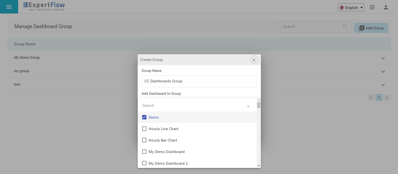
Adding a Group
Give a name to the group and select dashboards to be added in the group. To see the added dashboards in a group later, go to the Group list page, click to expand the desired group and see the list of dashboards added within it.
Once the group is created, you can configure the auto-scrolling between dashboards in the group and provide a scrolling delay (in seconds). On the Group list, expand the group to see all action options available.
Auto Scroll is set to Yes by default. Define the scrolling time in seconds. The default auto-scrolling time is set to 10 seconds.
Get the final link of the group by clicking Copy Link option on the group level. You can also edit the group with Add/Edit option on the group level to add or remove dashboards to/from the group later on.
For each dashboard in the group, options are available to get a link to the dashboard, copy to create a new dashboard or edit the dashboard directly from this page.
Data Services
Data service is a REST+GraphQL-based microservice that returns real-time and historical data to be displayed on Dashboards and Wallboards.
Third-party data services can be registered and added within the application to report on data statistics from an external system other than the Cisco call centers.
To add a data service, go to Data Services page from the main menu and click Add Data Service button.
Provide a name to the service in the Service Title field.
Give the Service URL in the format https://machineip/service-name
Sample Data Services: There are two data services available with this dashboard or wallboard
Agent Service:https://machineip/agent-service
Queue Service:https://machineip/queue-service
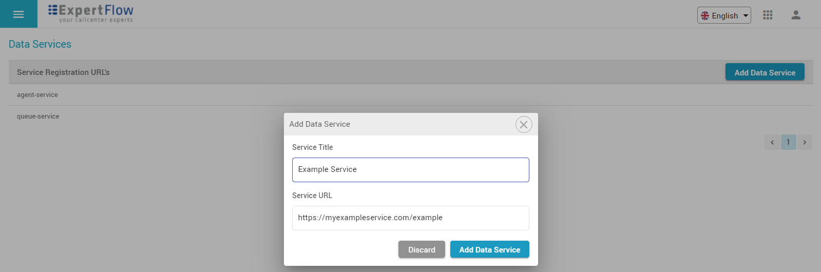
Adding a Data Service
Once a data service is added with a valid URL, you can use it while adding gadgets in a dashboard.
Building Gadgets using External Data Service
-
Integration with third-party systems does not come under the scope of ExpertFlow application unless otherwise specified.
-
Customer/partners can write their own data services to report from external systems in the same format as specified by ExpertFlow in the Dashboards&Wallboards API Guide.
Global Settings
Under the Settings menu, select the timezone for the dashboard for historical data, the default time zone is UTC if you do not select any timezone. and click the folder icon to select an image file for your corporate logo.
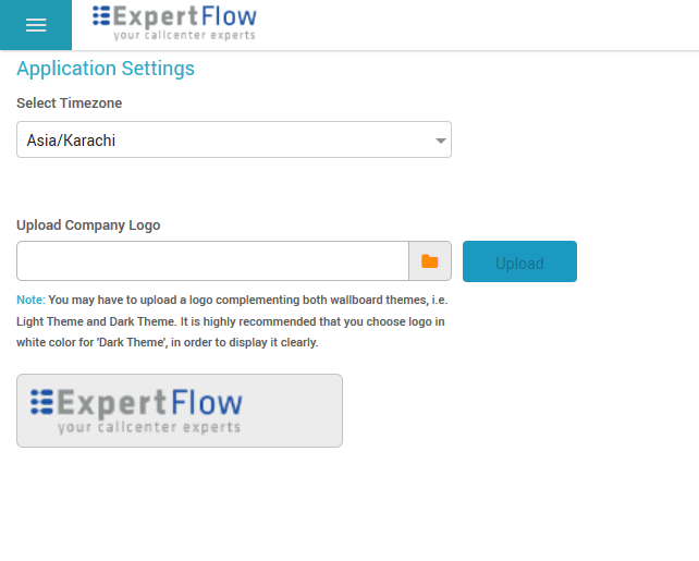
Uploading Timezone and Corporate Logo
Click Upload to upload the logo.
The logo uploaded from here appears all across the application pages and dashboard's final link.